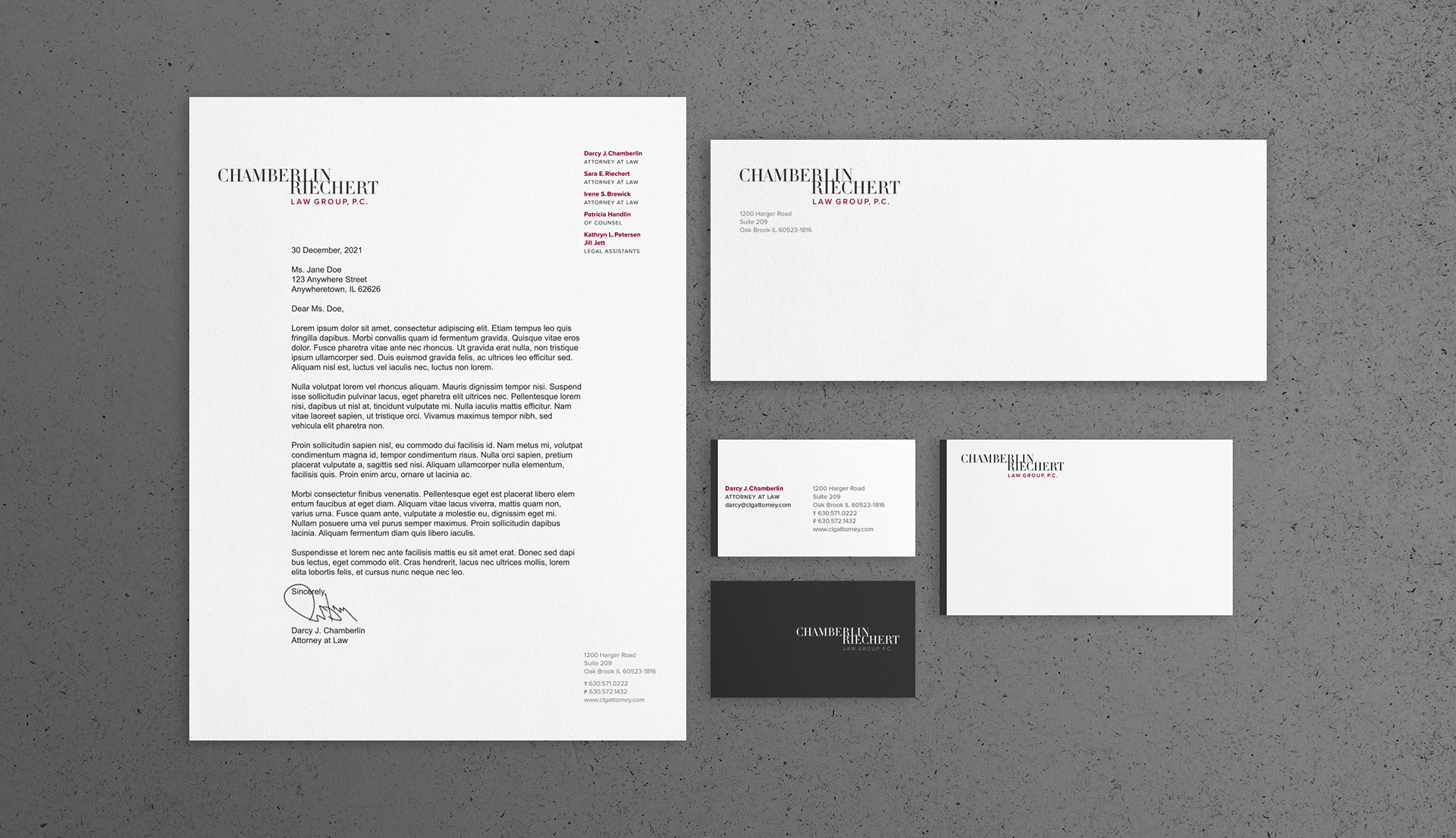
Chamberlin Riechert Law Group, P.C.
Chamberlin Law Group added a partner and needed to revise the group’s identity. The solution valued connection, sophistication, and simplicity in an effort to reflect trust and accessibility.
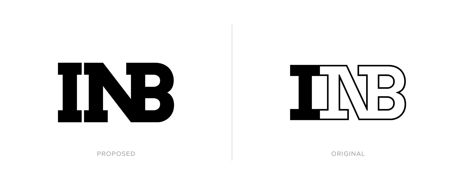
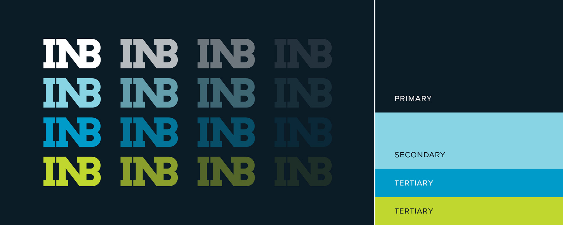
Illinois National Bank
Illinois National Bank thought they were ready for a change. They initiated rebranding efforts with the idea of appealing to a younger generation. Their existing logo was originally designed by the iconic New York design firm Chermayeff & Geismer and held up well over the years. The solution was to evolve the logo in a way that stayed true to the original design, but give it new life via minor modifications. Alas, the idea of replacing all identity materials at once proved too overwhelming and the original INB logo was retained.
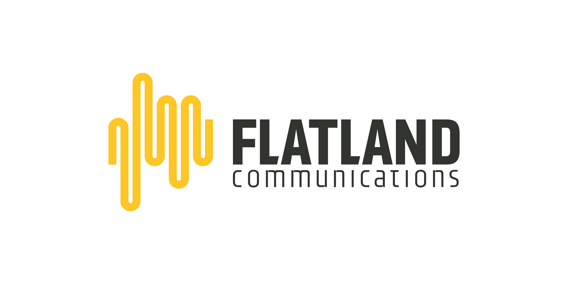
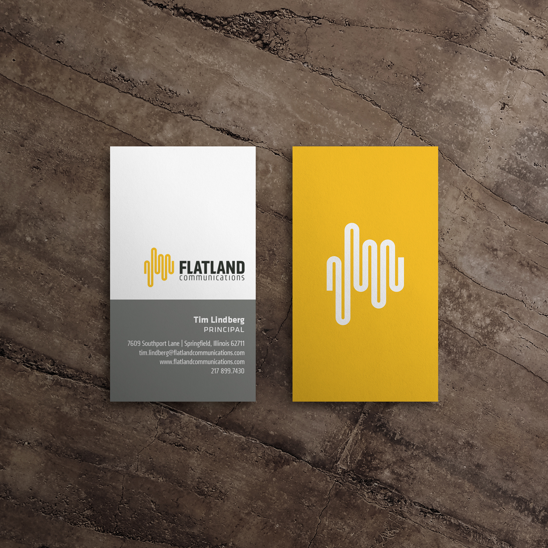
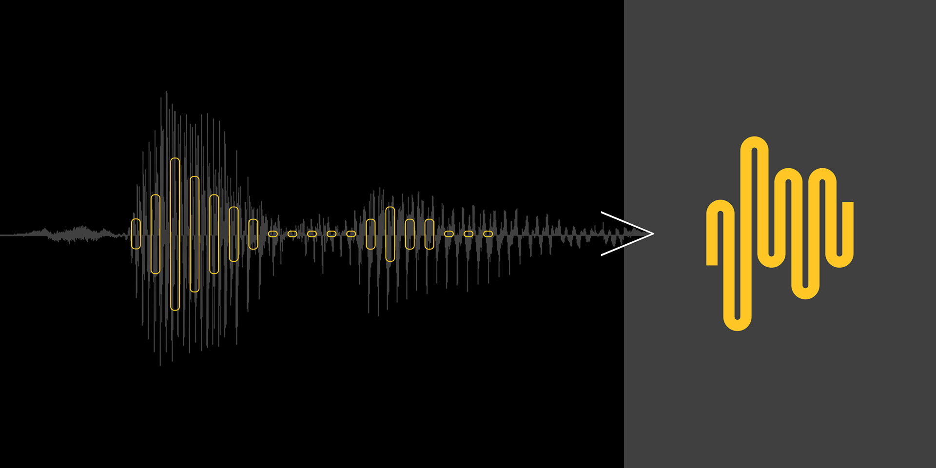
Flatland Communications
A corporate communications consultancy specializing in new product launches, issues management, and B2B social media. During the initial pre-production interview, Flatland principal Tim Lindberg continuously mentioned his job is to help clients “find their voice.” With this in mind, an audio track was created speaking the word “Flatland.” The resulting waveform, was illustrated and deconstructed into the simplified mark of the finished logo.
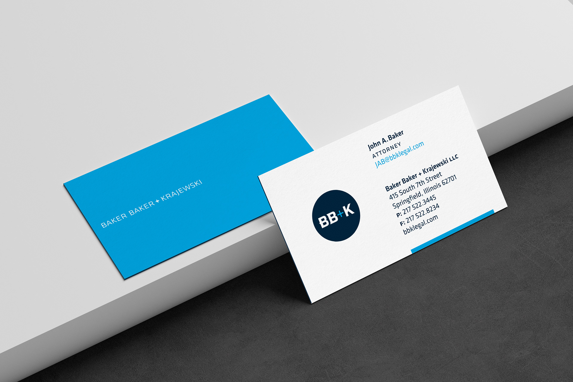
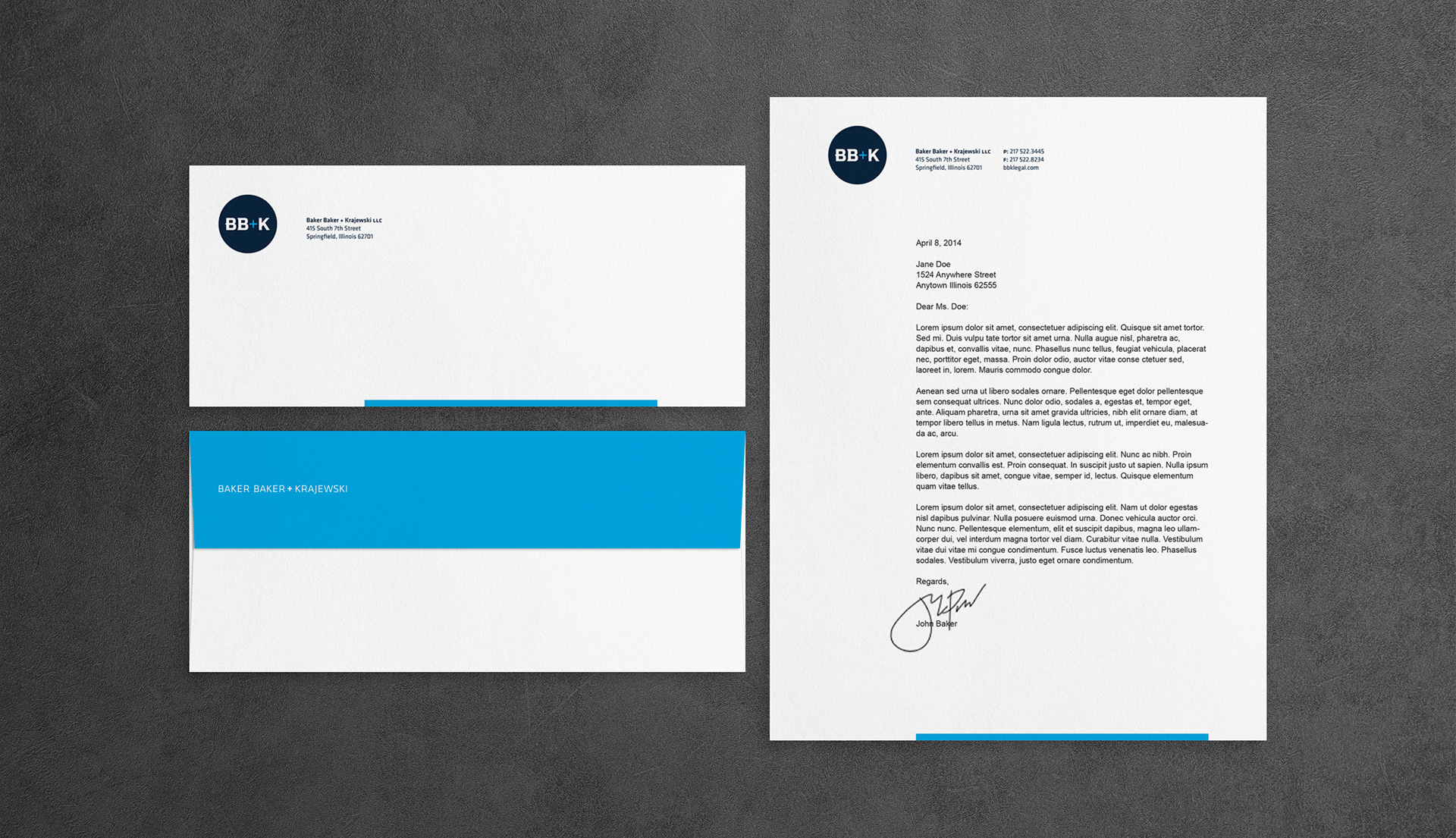
Baker Baker + Krajewski
A law group specializing in employment law and healthcare compliance related matters offering tailored solutions for each unique problem. The client revealed a desire for the identity to feel modern and minimal. The typeface Klavika was chosen for its cross of humanist and geometric influences, while the K was a custom solution. Subtle adornments were added to the B's to add visual interest and signify the individuality of the two Bakers.
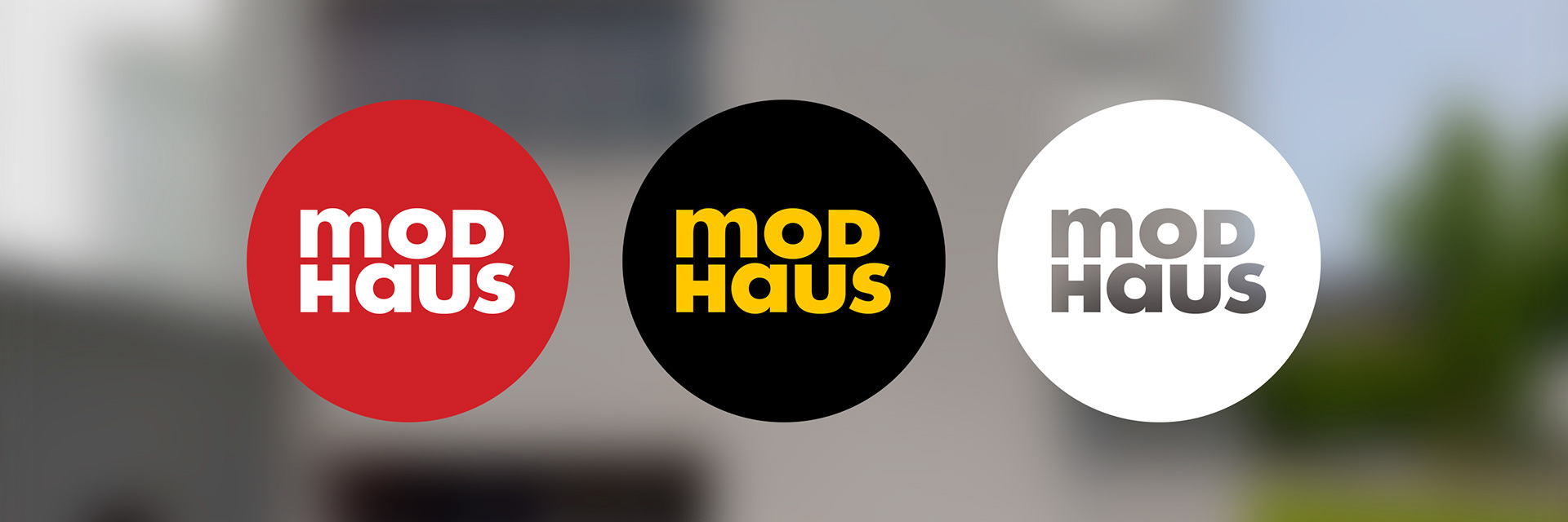
Modhaus
Modhaus is a home decor company focused on the unification of form and function. The identity has an eye on past design sensibilities while being executed with a modern twist. It is a solution that would feel at home as a mid-century brand, but unmistakably from this era. Familiar, but new.
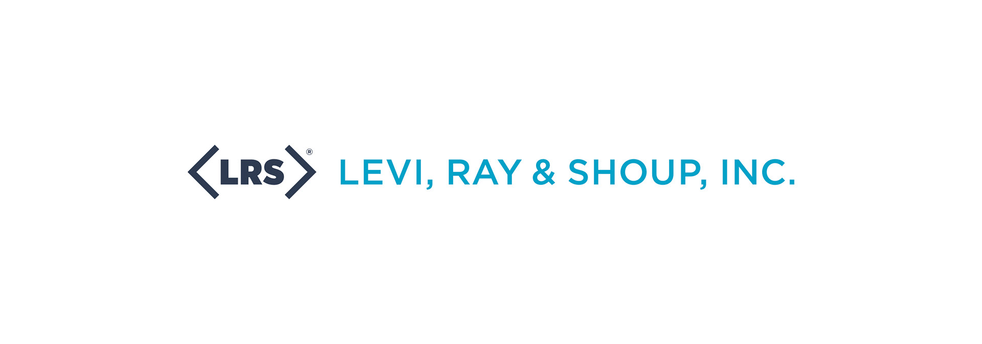
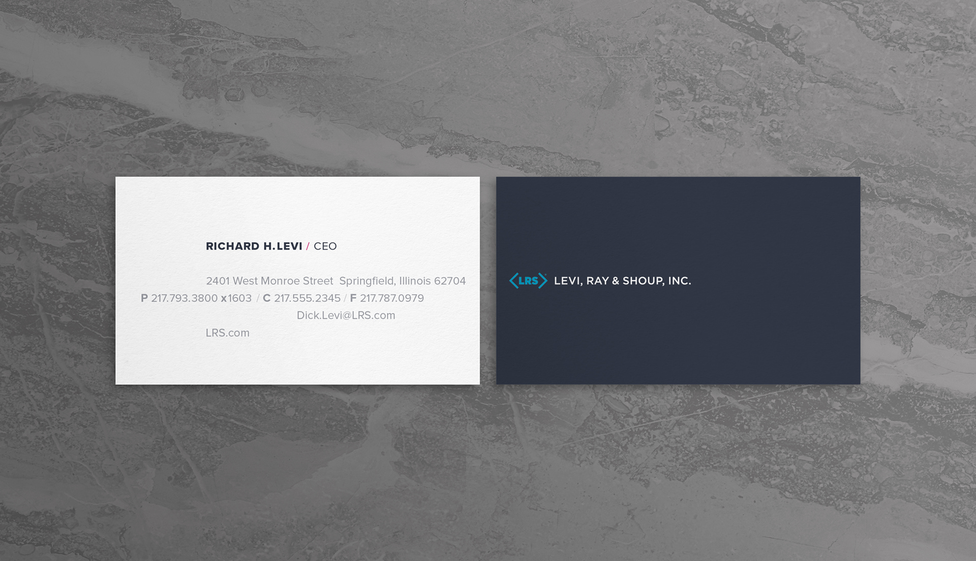
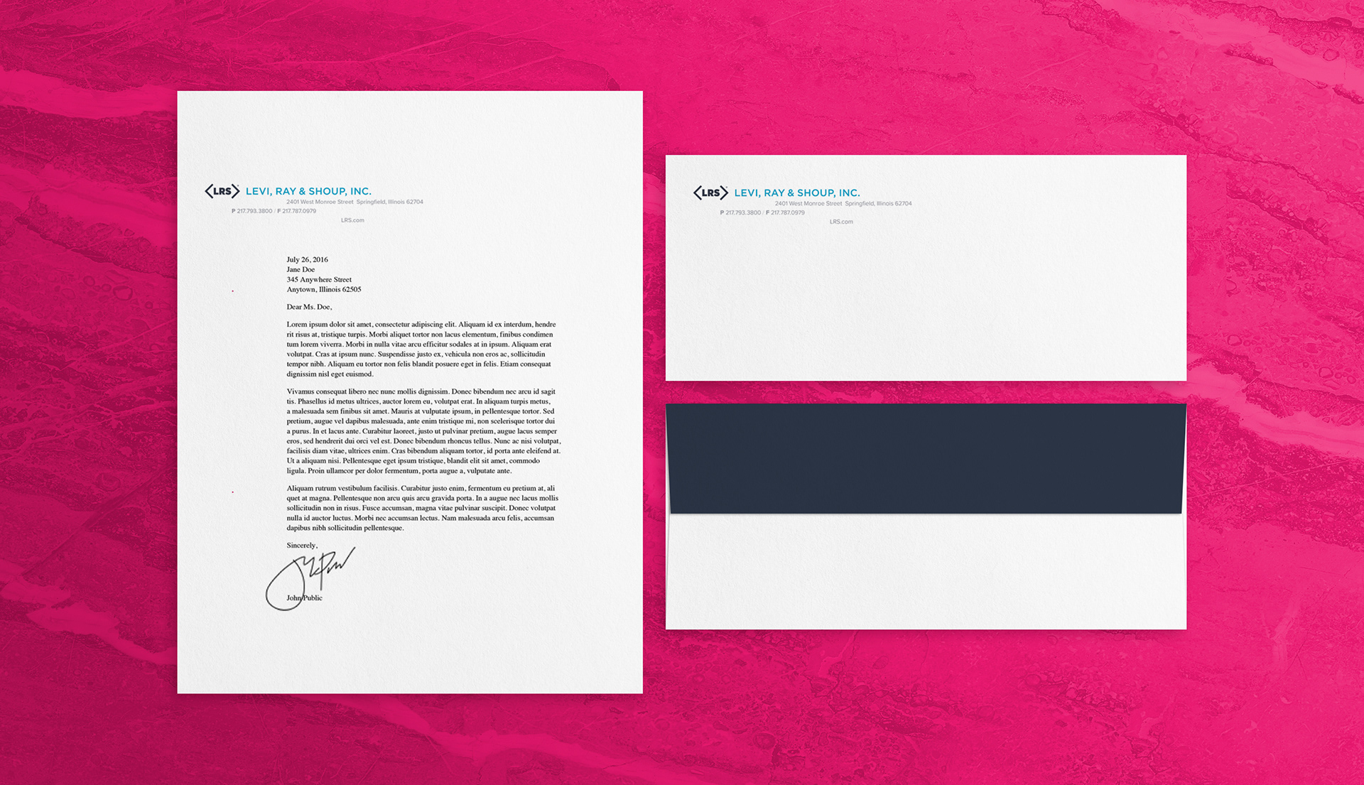
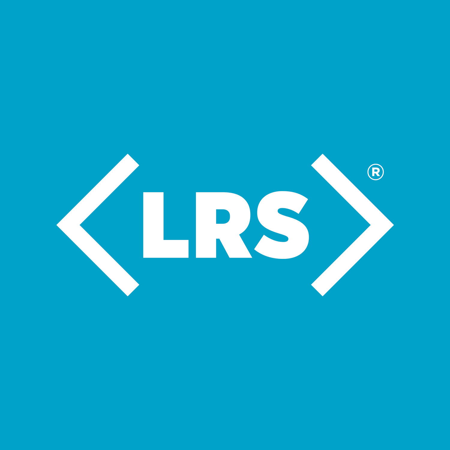
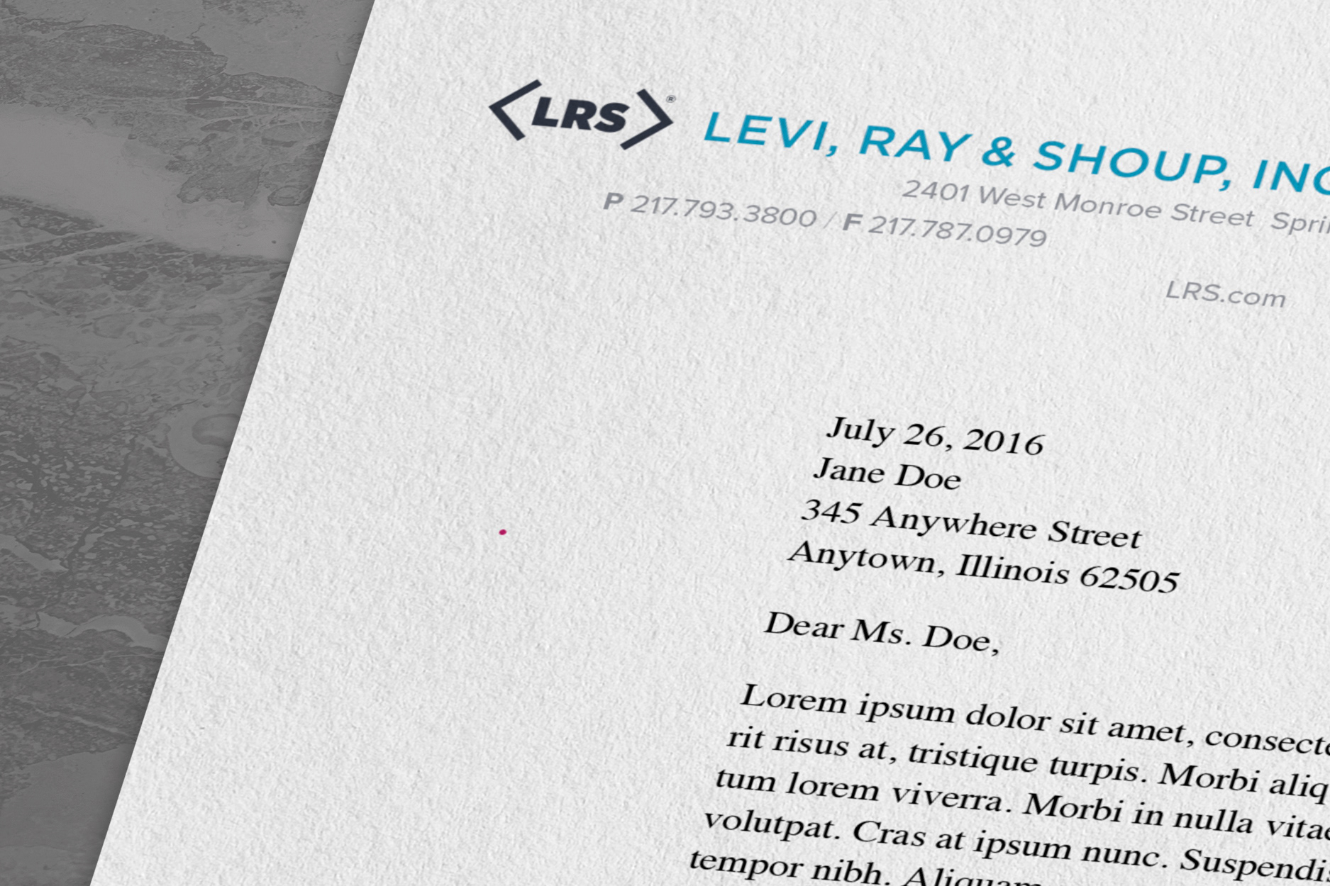
Levi, Ray & Shoup, Inc.
LRS, an international technology company founded in 1979, wanted to refresh their visual identity. The task came with the stipulation that the rebrand must give a nod to their past logo, which consisted of the LRS initials (set in Helvetica) within the outline of an oblong diamond shape. The solution was to update the typeface to the more modern, geometric Proxima Nova and deconstruct the outline to mimic angle brackets, which simply hint at the original diamond.
Geek City Guides
Started by identical twin brothers who are passionate about all things geek, Geek City Guides is a site made for anyone searching for comic shops, gaming, and attractions across the country. The logo design was inspired by superhero emblems and location markers.